The booking widget displays in one of three views automatically according to the available width - Wide, Overlaid time slots and a Narrow view.
The width of the parent HTML element in which the booking widget shortcode is placed determines which view the booking widget is displayed in.
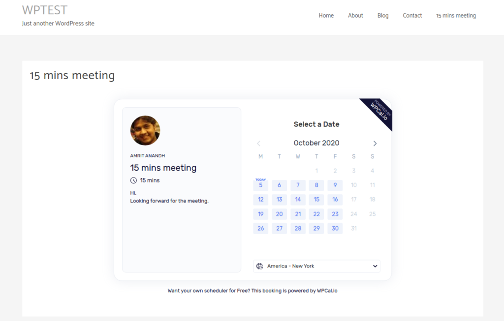
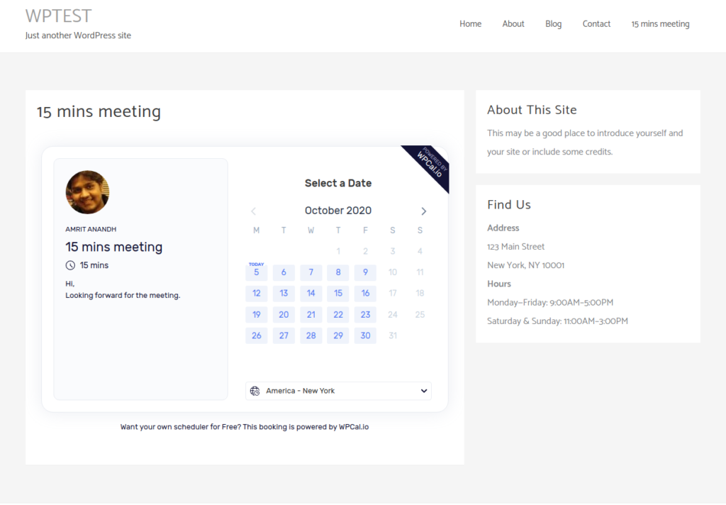
- Wide view - From 1000px and more. (E.g Full width content area without sidebar)
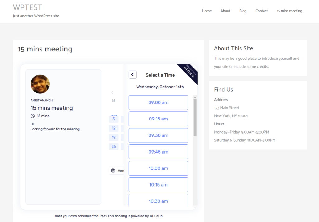
- Slots overflow view - From 700px to 999px. (E.g Content area with sidebar)
- Narrow view - From 699px and below. (Closer to mobile view, can be used in desktop view).
Note: The views cannot be set manually. It'll be displayed automatically according to the available width.
Wide view - Parent element having a width 1000px and more.
![](https://firebasestorage.googleapis.com/v0/b/hndesk-prod.appspot.com/o/docs%2F5b975a8dff056b6ff9fcaccb%2F65f60721bdb1f21e7942e363%2F1710622526359_image.png?alt=media&token=219b887e-4707-4e93-8138-d3ffeac79be6)
![](https://firebasestorage.googleapis.com/v0/b/hndesk-prod.appspot.com/o/docs%2F5b975a8dff056b6ff9fcaccb%2F65f60721bdb1f21e7942e363%2F1710622537199_image.png?alt=media&token=76d45c05-881a-47cc-a92c-4fdbc09eae6a)
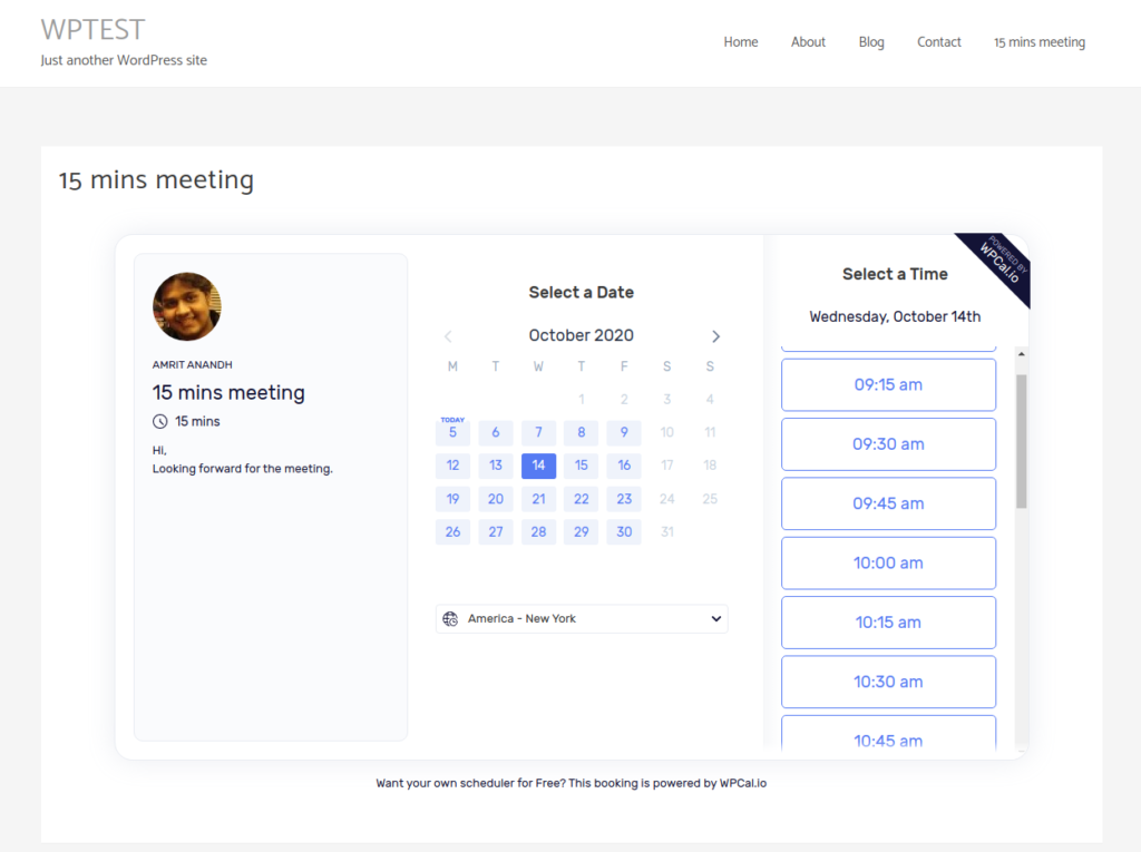
Overlaid time slot view - Parent element of width from 700px to 999px.
![](https://firebasestorage.googleapis.com/v0/b/hndesk-prod.appspot.com/o/docs%2F5b975a8dff056b6ff9fcaccb%2F65f60721bdb1f21e7942e363%2F1710622545089_image.png?alt=media&token=6cb70efd-2c23-4d57-b338-193e633863f0)
![](https://firebasestorage.googleapis.com/v0/b/hndesk-prod.appspot.com/o/docs%2F5b975a8dff056b6ff9fcaccb%2F65f60721bdb1f21e7942e363%2F1710622552914_image.png?alt=media&token=b4225c40-a41b-4b83-98f5-7ea24ab00c15)
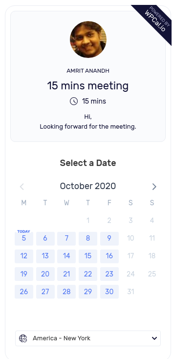
Narrow view - Parent element of width from 699px and below. Similar to mobile view.
![](https://firebasestorage.googleapis.com/v0/b/hndesk-prod.appspot.com/o/docs%2F5b975a8dff056b6ff9fcaccb%2F65f60721bdb1f21e7942e363%2F1710622562377_image.png?alt=media&token=71d63d15-ef03-4b77-903a-5e505b46e304)
![](https://firebasestorage.googleapis.com/v0/b/hndesk-prod.appspot.com/o/docs%2F5b975a8dff056b6ff9fcaccb%2F65f60721bdb1f21e7942e363%2F1710622570976_image.png?alt=media&token=10427414-9d1d-42f9-8c7f-3d153631c889)
Narrow view will be used in mobile. For Tablets it will automatically adjust based on available width.